A 3D website is a site where some elements have volume: a product you can spin, a scene that moves as you scroll, objects you can grab with the mouse. It all runs in the browser thanks to WebGL, supported by current browsers on desktop and mobile.
I design this kind of site, and ordas.fr is one: the eye at the top of the home page and the objects floating across the pages are real 3D. This article answers the questions I get before a project: how much it costs, what it looks like, whether it slows the site down, and whether it's worth it for you.
A 3D website is a site where part of it is rendered live in three dimensions, instead of being a flat image or a video. You notice the difference straight away: the object reacts to the mouse, the finger or scrolling, and each visitor sees it from a different angle.
There are three levels, from lightest to heaviest:
- Touches of 3D in a regular site: an object in the header, an embossed logo, shapes that follow the mouse. That's what ordas.fr does.
- A product in 3D you can spin, zoom and recolour. Useful for online sales or a launch.
- A full experience: the whole site is a scene you move through like a small game. Impressive, but longer to produce and more demanding for phones.
A 3D website has no catalogue price, because two projects almost never have the same amount of 3D. With me, every 3D project is quoted after a conversation to understand what the 3D needs to show. Here's what pushes the bill up or down, so you know what to prepare.
- The number of scenes. A single header scene isn't the same work as a multi-step journey.
- The 3D models. If you already have your product files (often from the manufacturer or design office), we start from those. Otherwise they need to be created or commissioned.
- The interactions. Spinning an object is simple. Physics (objects that fall, bounce, get thrown), a colour configurator or a mini-game add time.
- Sound and scroll animation. A camera that follows the scroll needs real staging work.
- Languages and online sales. An English version or a cart sit on top of the 3D and are quoted separately.
- Optimisation. The invisible part: lighter models, a fallback version, testing on old phones. It's what separates a 3D site that loads from a 3D site people leave.
- The deadline. A tight launch date costs more than a project with time to breathe.
- What the 3D should show, in one sentence (a product, a place, a method).
- Existing 3D files or plans, even partial ones.
- Two or three sites you like, and what you like about them.
- The date the site needs to go live.
With these four things, a quote fits in a few clear lines. To read website quotes in general, I wrote a guide on how to compare website quotes.
Rather than sending you to galleries of award-winning sites, here are projects I built myself, and what the 3D brings to each. You can open all of them.
On the home page, a large 3D eye follows your mouse, and objects (spheres, rings, stars) float across every page. With a mouse, you can grab and throw them; they bounce off the screen edges and off the eye. Text, headings and links stay normal HTML: Google reads them like on any other site.
If the browser can't handle 3D, still images take over. If you've asked your phone or computer to reduce motion, the animations stop.
KNTC Vector is the launch site for an imaginary running shoe, built with three.js, GSAP and Lenis. The 3D stages the product, with scroll-driven scenes and colour and size pickers, like a real product page.
HYALO presents an invented sports mask with its four frames and four coatings. WebGL lens and light effects show what a photo can't: how the lens changes with the angle.
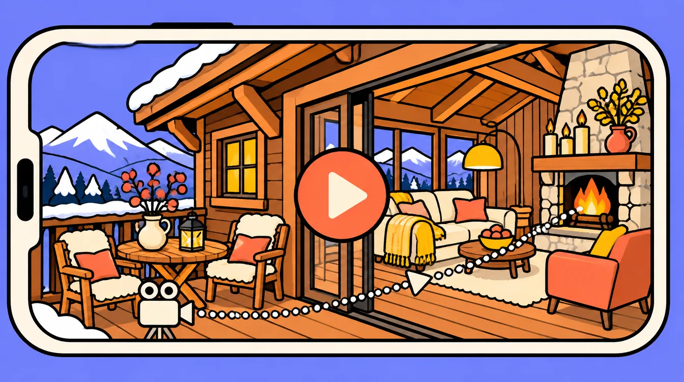
For Virginie Verrier's website, a Lyon painter, I used a different technique from KNTC. Nothing is rendered live: the gallery walkthrough is a sequence of 1,003 images, shown frame by frame as you scroll. You move through the room by scrolling the page, and clickable points on the paintings open each work.
It feels as immersive as a 3D scene, but the image is fixed in advance: the quality is that of a film, and the phone has nothing to compute. The trade-off is that the visitor follows the planned path, whereas on KNTC the scene is rendered live by three.js. The site uses no library at all.
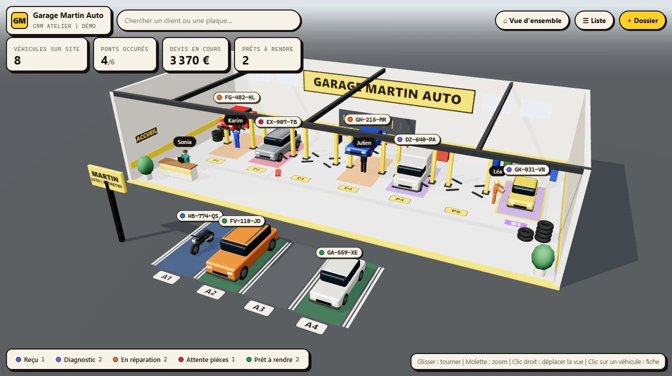
3D isn't only for the shop window. In this custom CRM for a garage, the main screen is the workshop seen from above in 3D: each vehicle is in its place, and you grasp the day at a glance.
Yes, if it's done badly. No, if it's designed from the start to stay light. Google measures speed with the Core Web Vitals: the main content should appear in under 2.5 seconds (LCP) and the page should respond to a click in under 200 milliseconds (INP).
A 3D site can meet these thresholds if it follows a few rules:
- Text arrives before the 3D. The heading and content show straight away; the scene loads afterwards.
- Lighter models. A 3D file exported from design software is often far heavier than needed. It gets compressed before going live.
- Content stays real text. A heading drawn inside the 3D scene is invisible to Google. Headings, paragraphs and links must stay HTML.
- A fallback version. Still images if 3D can't render, animations off if the visitor has disabled them.
- Nothing runs off screen. The scene pauses when it scrolls out of view.
A slow site drives people away, with or without 3D: it's the first cause I listed in why visitors leave a website.
Yes, mobile browsers display 3D, but a phone has less power and a smaller screen than a computer. So a good 3D site isn't the same on both: on mobile, quality is reduced, interactions are simplified and anything needing a mouse is avoided.
On ordas.fr for example, the glass-drop cursor only exists on desktop, and phones get fewer objects that can't be grabbed, so they don't get in the way of scrolling. The test that matters is an average phone a few years old, not the latest model.
3D is useful when what you sell is hard to explain in a photo. It's much less useful when your customers just want an address and a phone number.
- Product launches and brands: an object you can spin holds attention longer than a photo.
- Manufacturers and industry: showing a part, a mechanism, an assembly.
- Architecture, new-build property, interior design: picturing a place that doesn't exist yet.
- Tourism and exceptional venues: making people want to visit.
- Creatives and studios: the site itself becomes proof of the craft.
For a plumber, a practice or a neighbourhood restaurant, a fast, clear site pays off more. I say it plainly in meetings: adding 3D where it serves no purpose is budget better spent on SEO.
Video tells a story you control end to end; 3D lets the visitor explore. The two often work very well together.
- Choose video for a mood, a testimonial, a demo where order matters. It's easy to share on social media.
- Choose 3D when the visitor needs to choose what to look at: an angle, a colour, a part. It adapts to every screen instead of being a fixed file.
- Combine both: a video for social media, 3D on the site for those who want to go further.
You can build a 3D website yourself with visual tools, or have it developed to order. The right choice depends on what the 3D must do and who will update the site.
- [Spline](https://spline.design/): an online 3D editor made for designers. You build a scene and embed it in a site (Webflow, Framer, or code). Perfect for a decorative object or a mock-up.
- Webflow, Framer, Wix Studio: site builders that accept Spline scenes. Handy if you want to edit your own text.
- [three.js](https://threejs.org/) and React Three Fiber: code libraries. That's what I use: anything is possible (physics, configurator, scroll-linked scene), and performance can be fine-tuned.
- Blender: the free software to create and lighten 3D models before putting them online.
Visual tools are fast for a simple effect. As soon as you need physics, a configurator or real mobile optimisation, custom development takes the lead.
- Putting 3D everywhere. One strong scene beats ten competing effects.
- Hiding the message. If people can't tell what you do within seconds, 3D won't save you.
- Forgetting the phone. A large share of your visitors arrive there: test on it before anything else.
- Putting text in the image. Google doesn't read a heading drawn in a 3D scene.
- Ignoring accessibility. Animations must be able to stop, and the site must stay usable with a keyboard.
To see what 3D could do for your project, my 3D website design page details the method, and every project starts with a free conversation.
There's no fixed price: the cost depends on the number of scenes, the 3D models to create or reuse, the interactions and the mobile optimisation work. With me, every 3D project is quoted after a conversation about what the 3D should show.
For a simple effect, an editor like Spline embedded in Webflow or Framer is enough. For physics, a configurator or real mobile optimisation, you go through code with three.js or React Three Fiber, and Blender to prepare the models.
No, as long as text stays HTML, the page displays quickly and the 3D loads after the content. It becomes a problem when headings are drawn inside the scene or the page takes too long to show.
Yes, mobile browsers display 3D. You just need to adapt quality and interactions to the phone, and test on an average model a few years old.
A well-built site shows a fallback, for example still images instead of the scenes. Content and links stay accessible.
It's not required, but if you have your product files we start from those, which is faster. Otherwise the models are created or commissioned for the project.
Video tells a story in a set order and is easy to share. 3D lets the visitor explore a product or a place. Often the two complement each other.